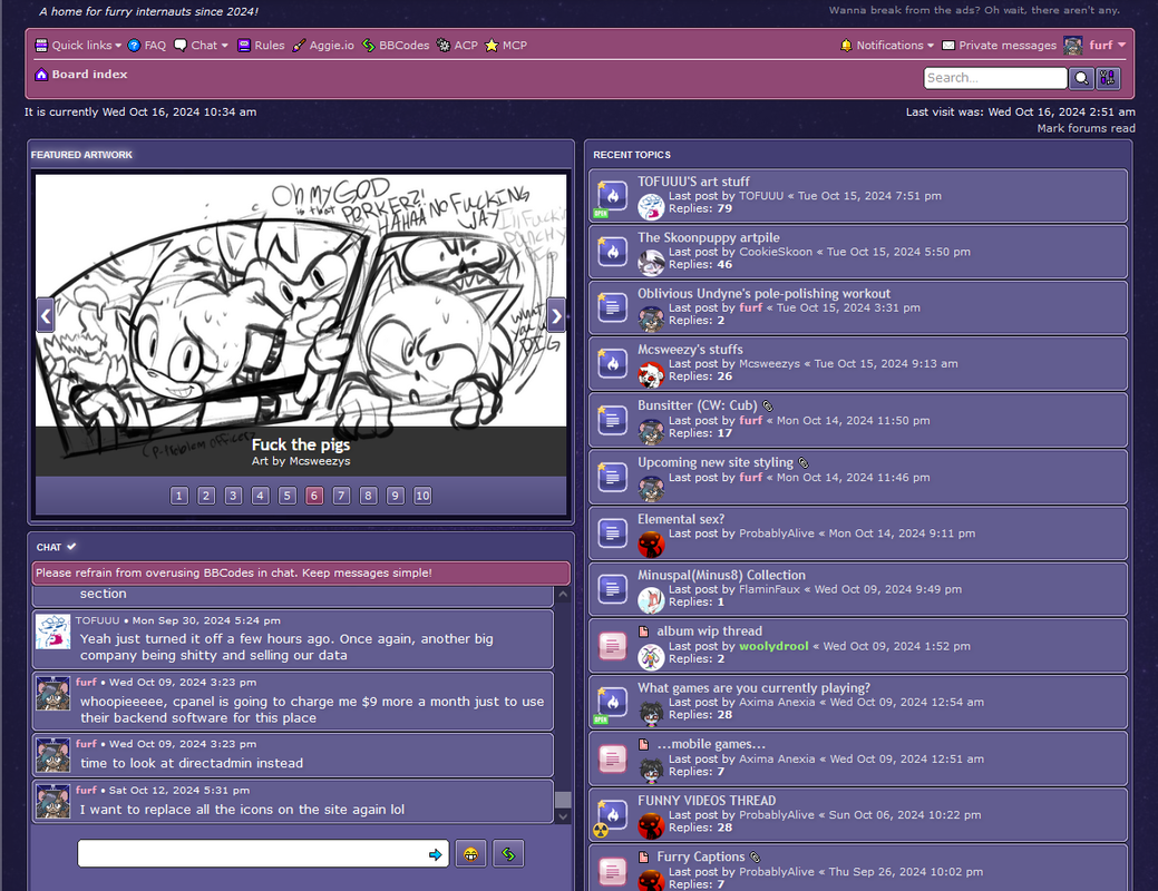
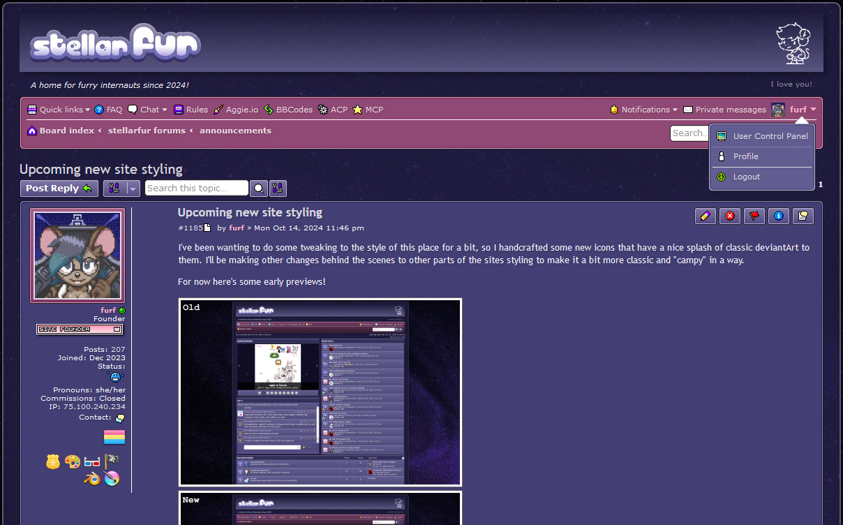
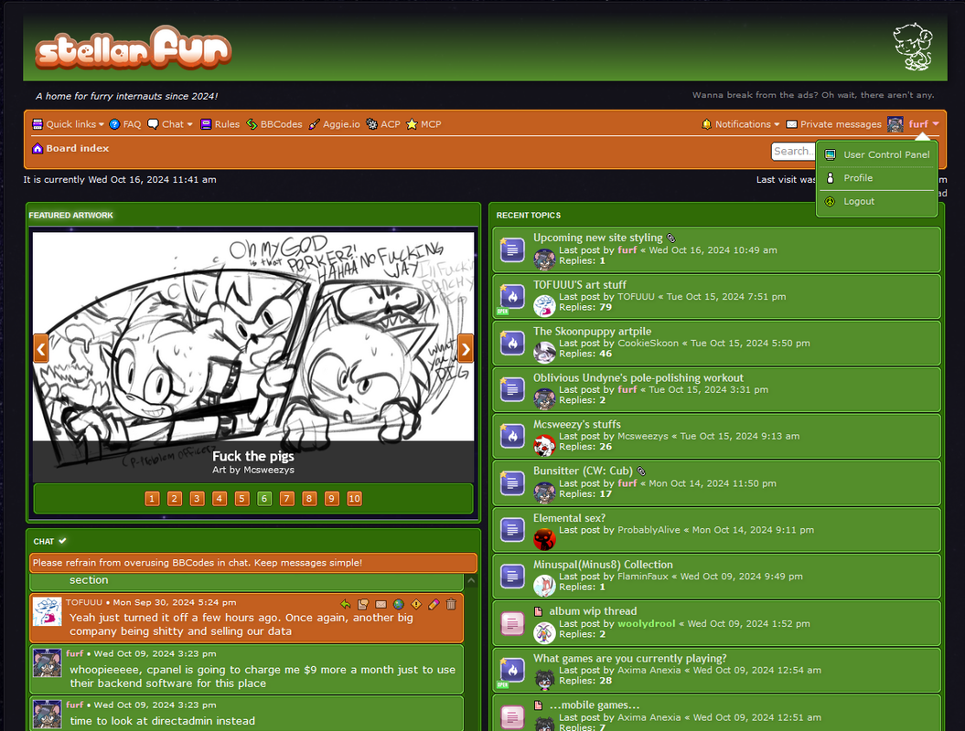
I've been wanting to do some tweaking to the style of this place for a bit, so I handcrafted some new icons that have a nice splash of classic deviantArt to them. I'll be making other changes behind the scenes to other parts of the sites styling to make it a bit more classic and "campy" in a way.
For now here's some early previews!
Key differences are currently just to the icons on various places of the UI, but I intend to further optimize the style to make it both more consistent and run smoother on older hardware.


